

MIKITYPE|Frost and Quartz
2025.9.18–10.13
Taos Gallery Tokyo (六本木)
東京都港区元麻布3-10-1-3F
Contact: contact@taostokyo.jp
MIKITYPE|Frost and Quartz
September 18 – October 13, 2025
Taos Gallery Tokyo(Roppongi)
3F, 3-10-1, Motoazabu, Minato-ku, Tokyo
Contact: contact@taostokyo.jp
2025.9.18–10.13
Taos Gallery Tokyo (六本木)
東京都港区元麻布3-10-1-3F
Contact: contact@taostokyo.jp
MIKITYPE|Frost and Quartz
September 18 – October 13, 2025
Taos Gallery Tokyo(Roppongi)
3F, 3-10-1, Motoazabu, Minato-ku, Tokyo
Contact: contact@taostokyo.jp
ARTIST STATEMENT
Frost and Quartz
12世紀ヨーロッパの修道院文化の中で、羊皮紙を節約するために縦に圧縮された直線的な造形へと発展したブラックレターという書体がある。その硬質な形態は、永続性と秩序を宿す建築的な文字として、言葉を形象化した。グーテンベルク聖書に代表されるように、印刷文化においてもブラックレターは普遍性を帯び、「Quartz 石英」のごとき恒久的な象徴性を担った。
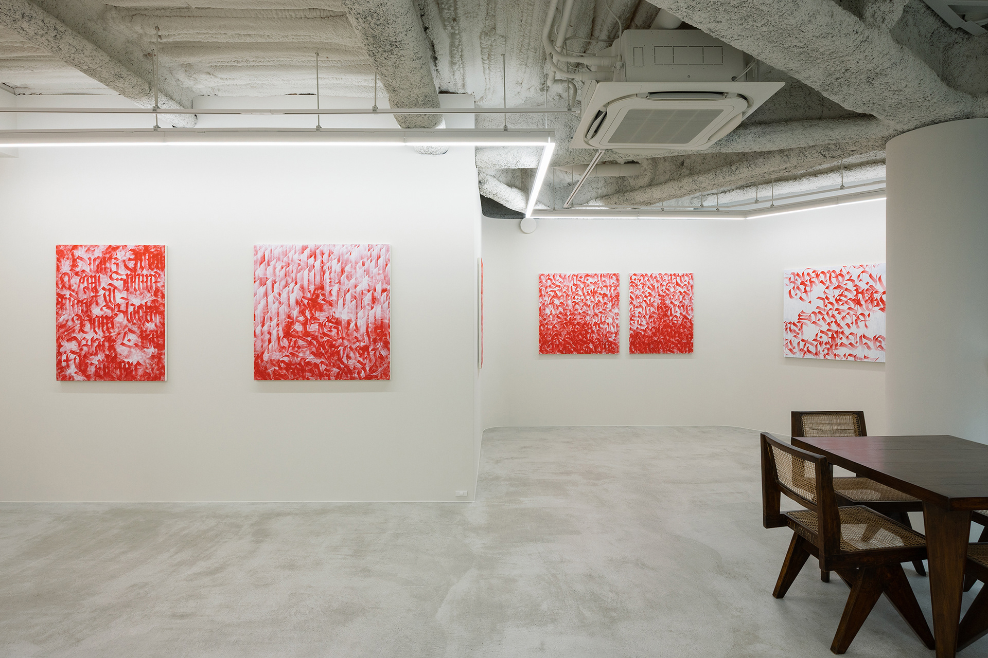
さらに中世写本文化における赤インクの使用、すなわちルブリケーションは、本文を黒で記しつつ、霊性や象徴性を帯びた赤を冒頭のイニシャルに配することで、言葉に秩序と神聖さを与えた。その結果、黒と赤の対比は単なる視覚的装飾を超え、精神的指向性をもつ美的体系を形成している。
これに対し、日本文化における文字観は、いろは歌に象徴される無常観に根ざす。「Frost 霜」は、朝日とともに消えゆく一瞬の輝きとして、短命ゆえの美を体現する。永遠性を志向する西洋の文字観に対し、日本の感性は儚さを美として受け止める。
Sphinx of black quartz, judge my vow.
黒き石英のスフィンクスよ、我が誓いを裁け
黒き石英のスフィンクスよ、我が誓いを裁け
このパングラム――アルファベット26文字をすべて含む一文は、西洋の結晶的構造性と日本の無常感受性を架橋するものとして機能する。こうした文字遊戯の精神は、日本において全音を網羅するいろは歌とも通じており、両者は文化を超えて普遍的な言葉の循環性を示している。
霜と石英、いろは歌とパングラム、ブラックレターとルブリケーション。本展、「Frost and Quartz」はそれらを交錯させることで、文字を単なる情報伝達の手段ではなく、存在や時間をめぐる象徴的表現として提示する。
MIKITYPE
Frost and Quartz
In the monastic culture of 12th-century Europe, a script known as Blackletter developed into a vertically compressed, linear form as a means of conserving parchment. Its rigid structure embodied permanence and order, rendering language as an architectural inscription meant to be preserved. As exemplified by the Gutenberg Bible, Blackletter retained its universality in the age of print, assuming an enduring symbolic presence akin to quartz.
Furthermore, in medieval manuscript culture, rubrication, the use of red ink that emphasized initials imbued with spirituality and symbolism, conferred order and sanctity upon the written word. The contrast between black and red exceeded mere visual decoration, forming an aesthetic system charged with spiritual orientation.
In contrast, the Japanese conception of script is grounded in the impermanence embodied by the Iroha poem. Frost is a momentary brilliance that vanishes with the morning sun, an embodiment of beauty precisely because of its brevity. While Western script aspired to eternity, Japanese sensibility embraced ephemerality as a form of beauty.
Sphinx of black quartz, judge my vow.
This pangram—a sentence containing all 26 letters of the alphabet—functions as a bridge between the crystalline structure of the West and the sensitivity to impermanence in Japan. Such a spirit of verbal play resonates with the Iroha poem, which encompasses all sounds of the Japanese syllabary. Together they demonstrate, across cultures, the universality and cyclical nature of language.
Frost and quartz, the Iroha and the pangram, Blackletter and rubrication. By allowing these to intersect, the exhibition Frost and Quartz presents writing not as a mere vehicle of information, but as a symbolic expression of existence and time.
MIKITYPE
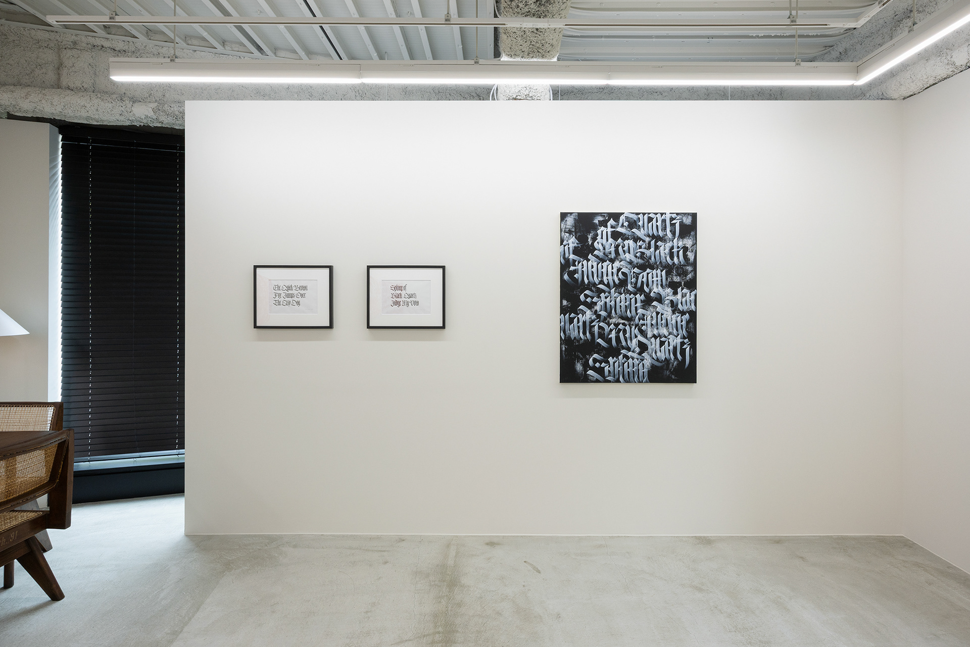
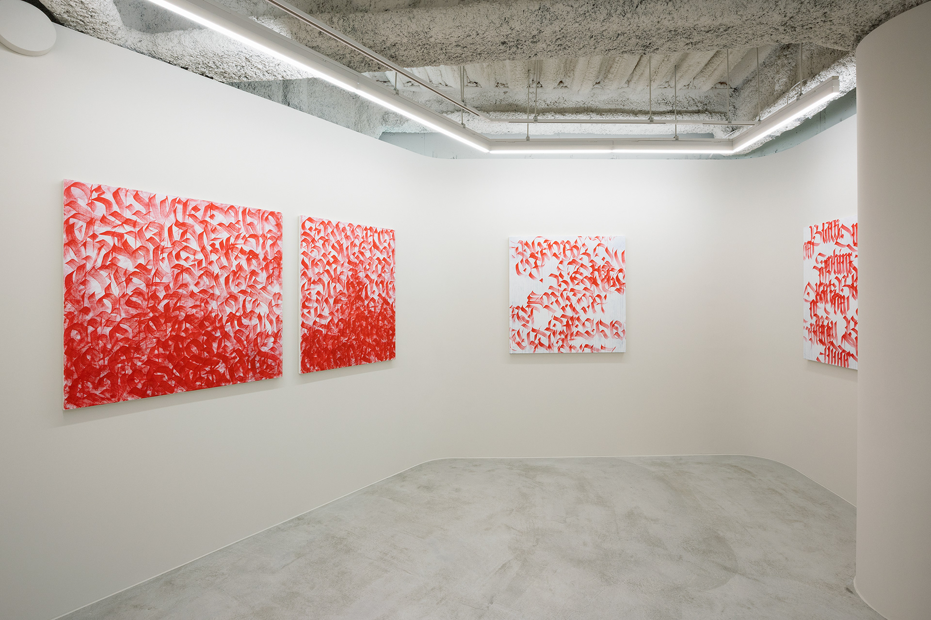
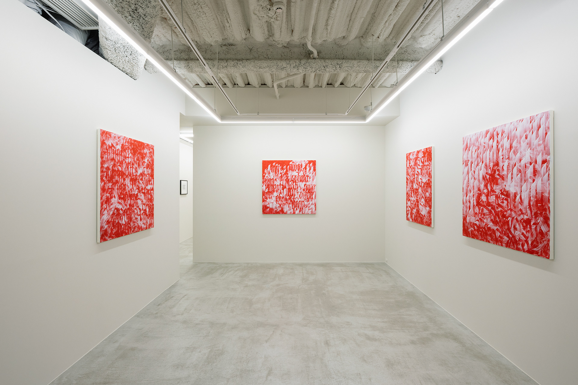
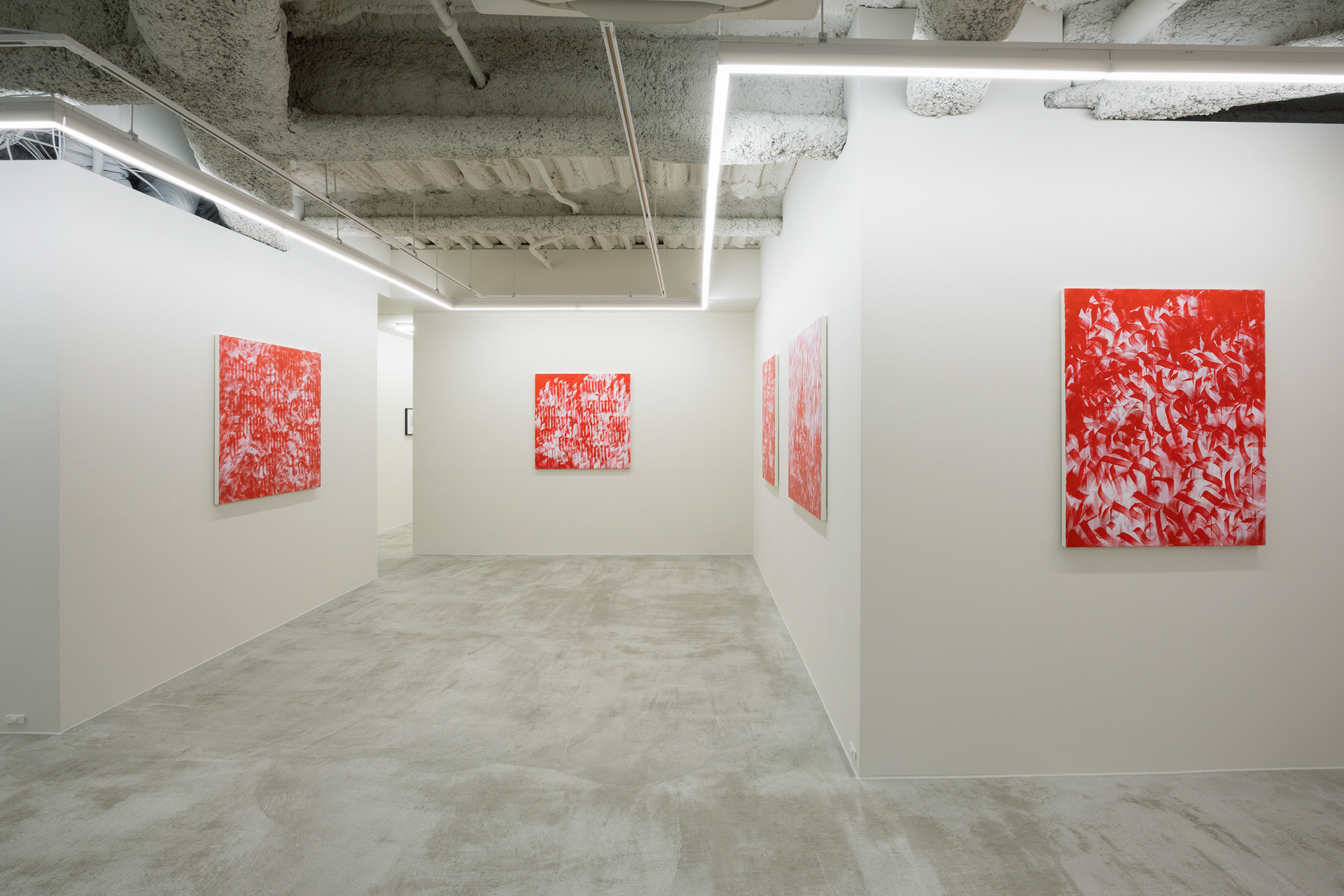
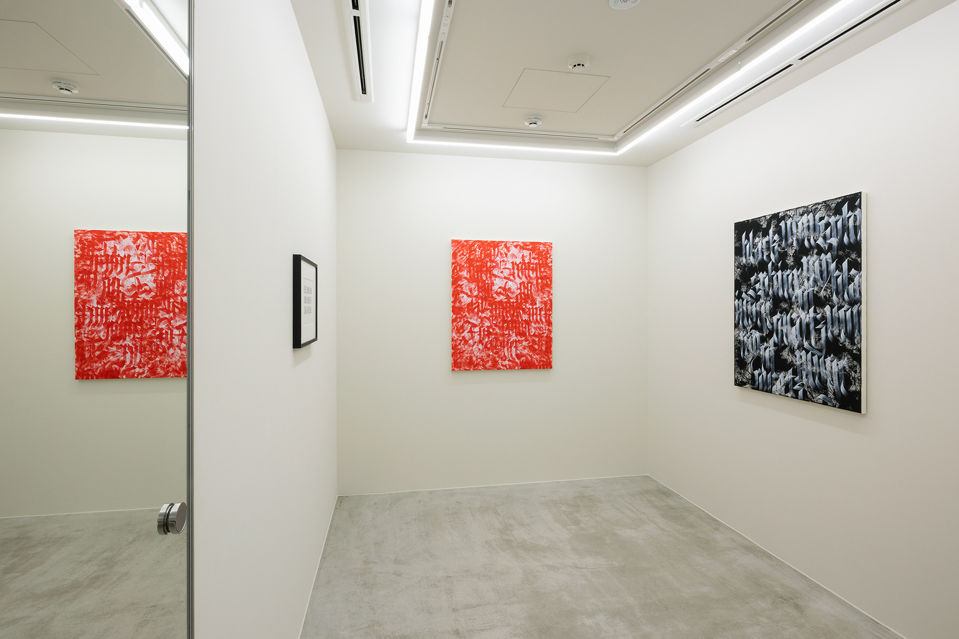
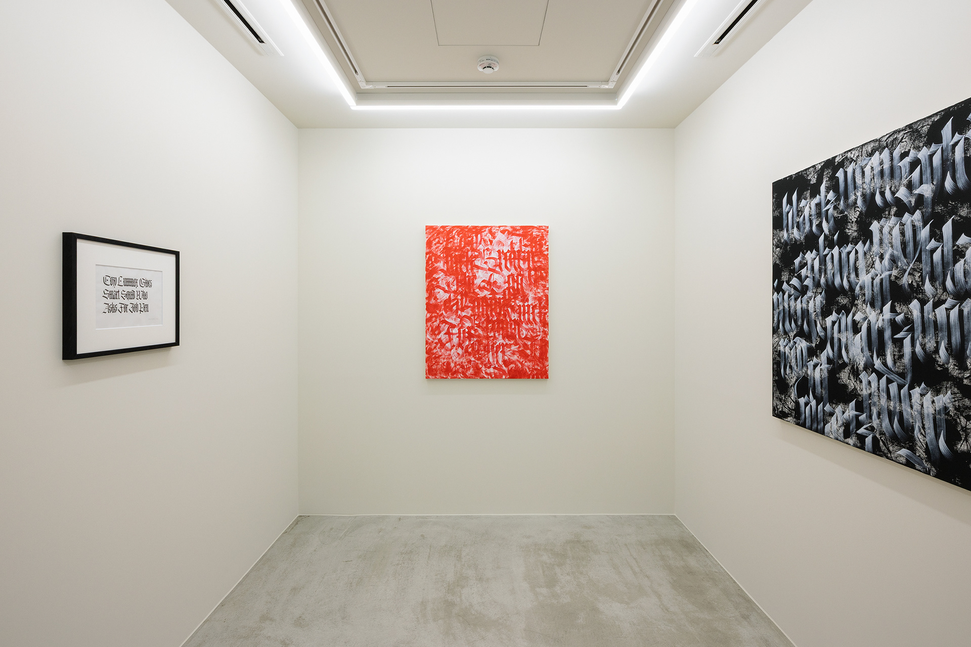
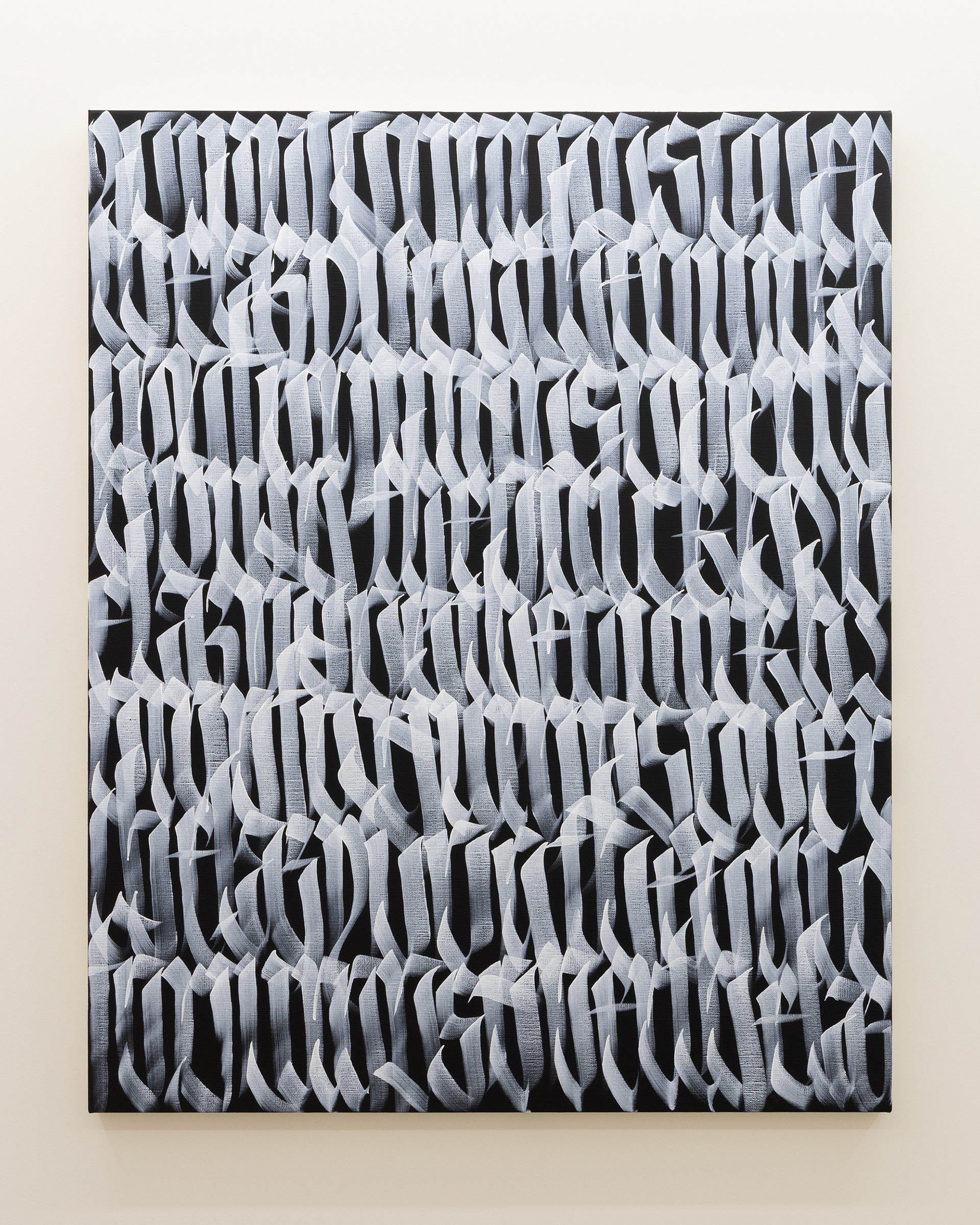
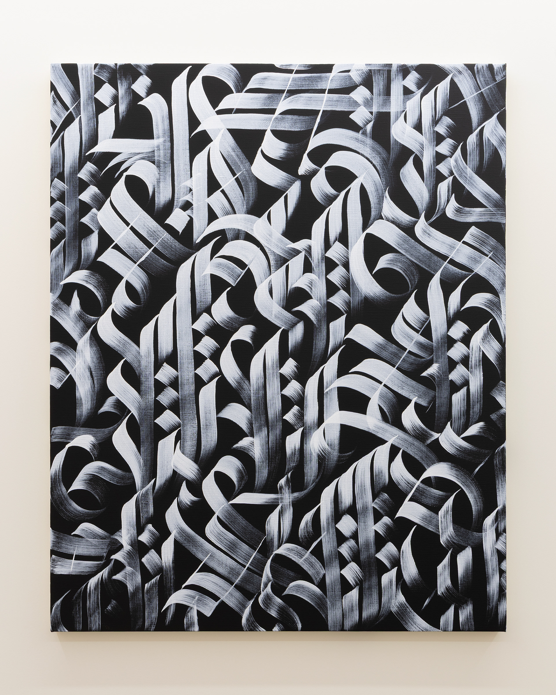
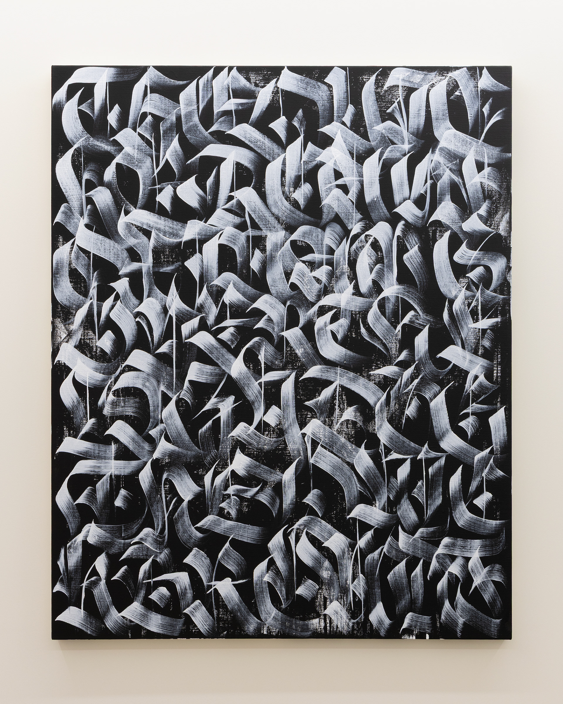
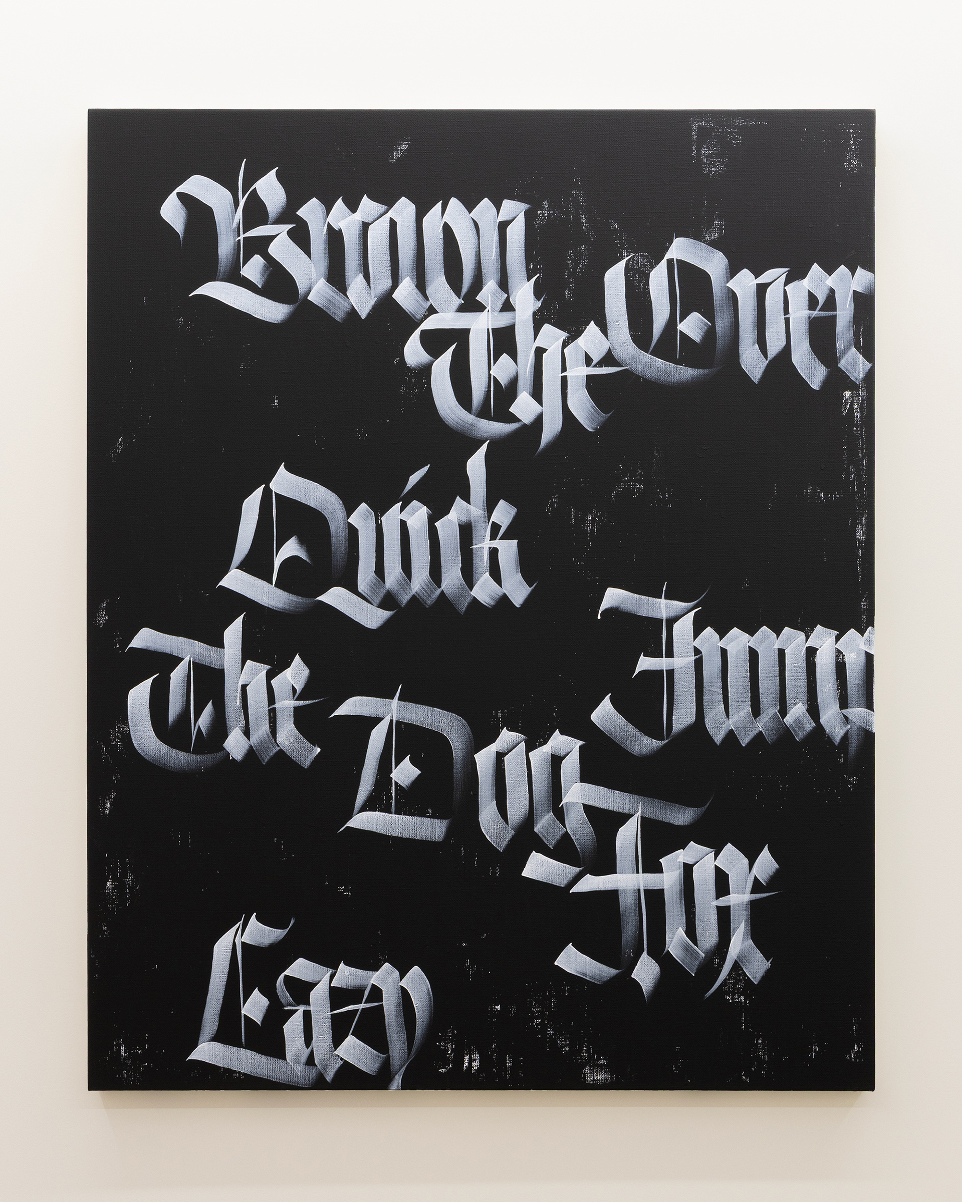
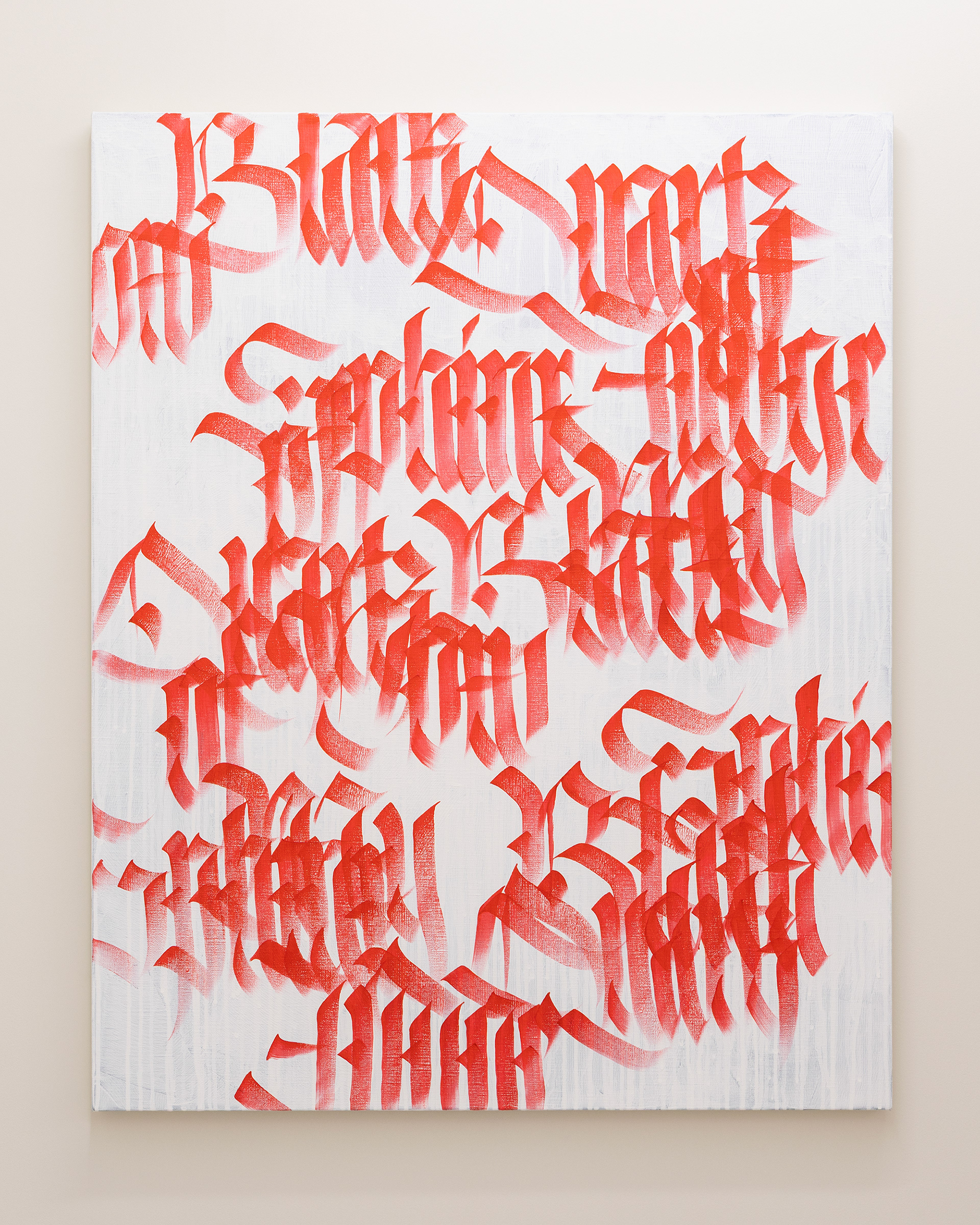
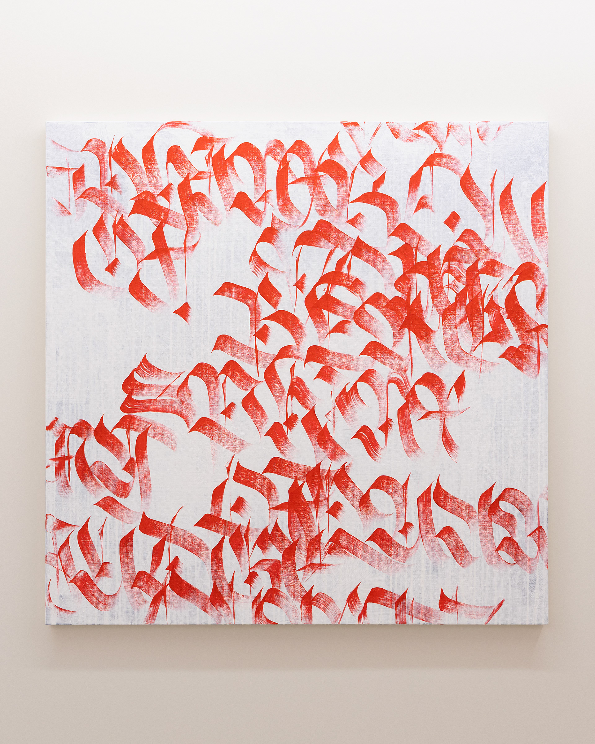
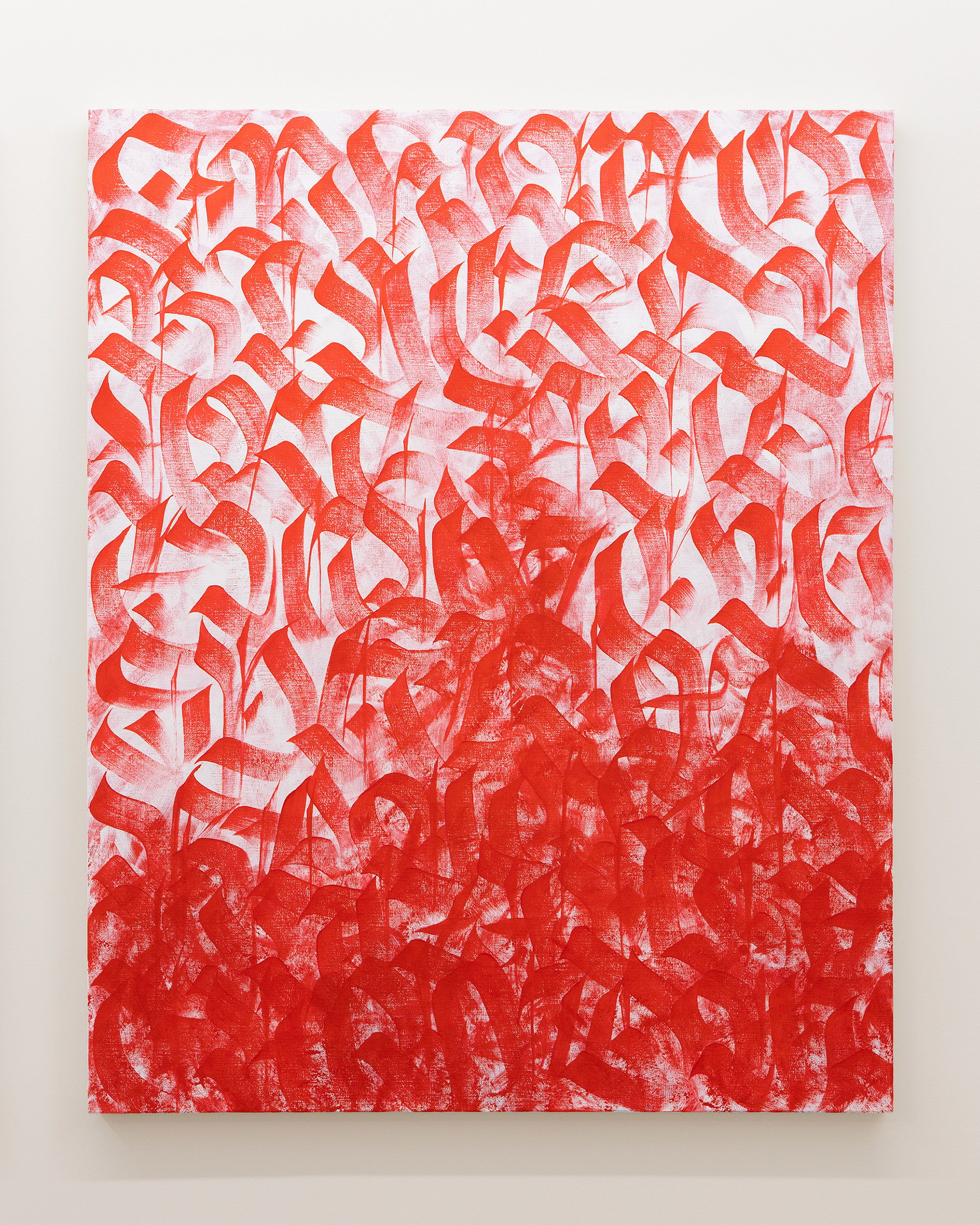
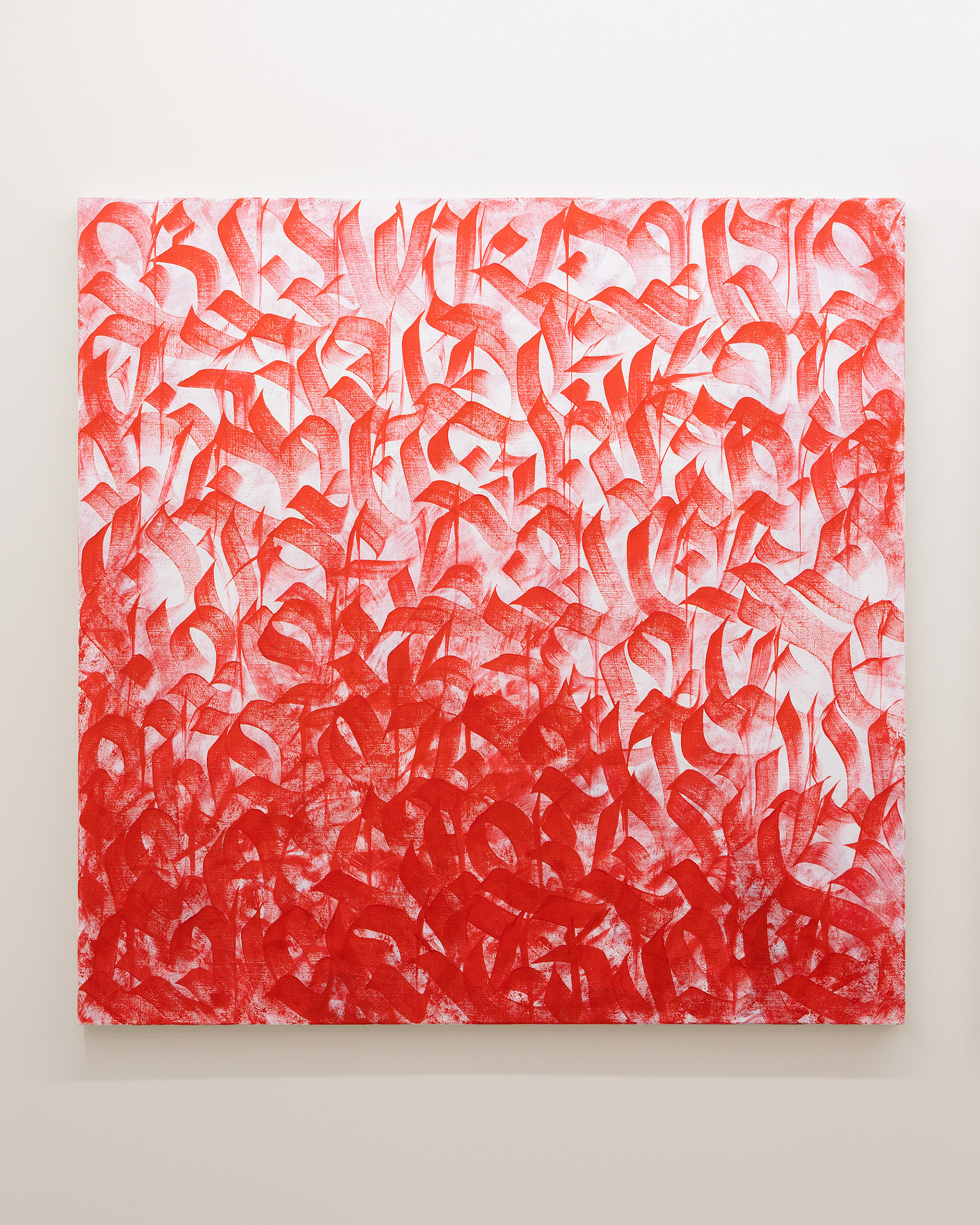
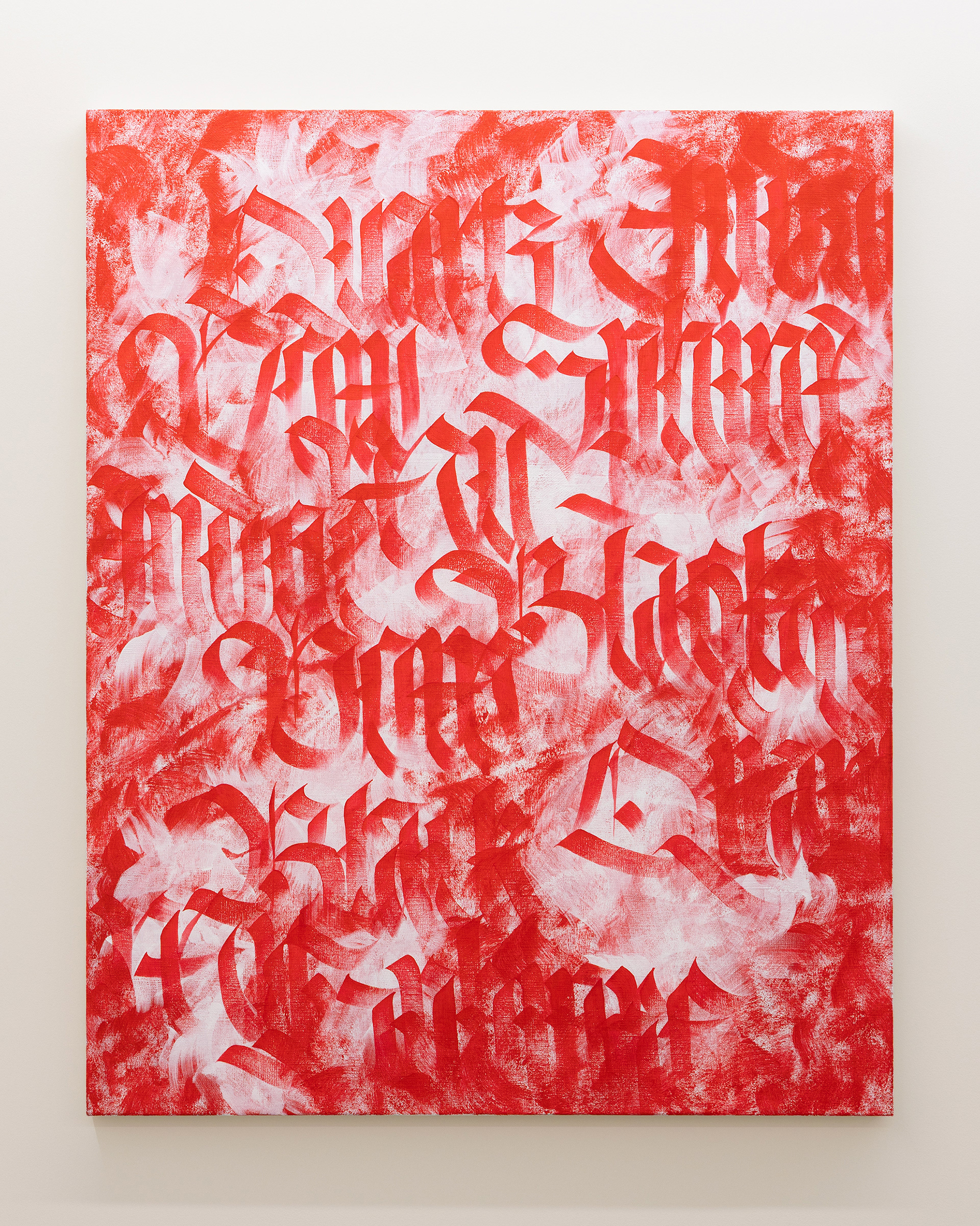
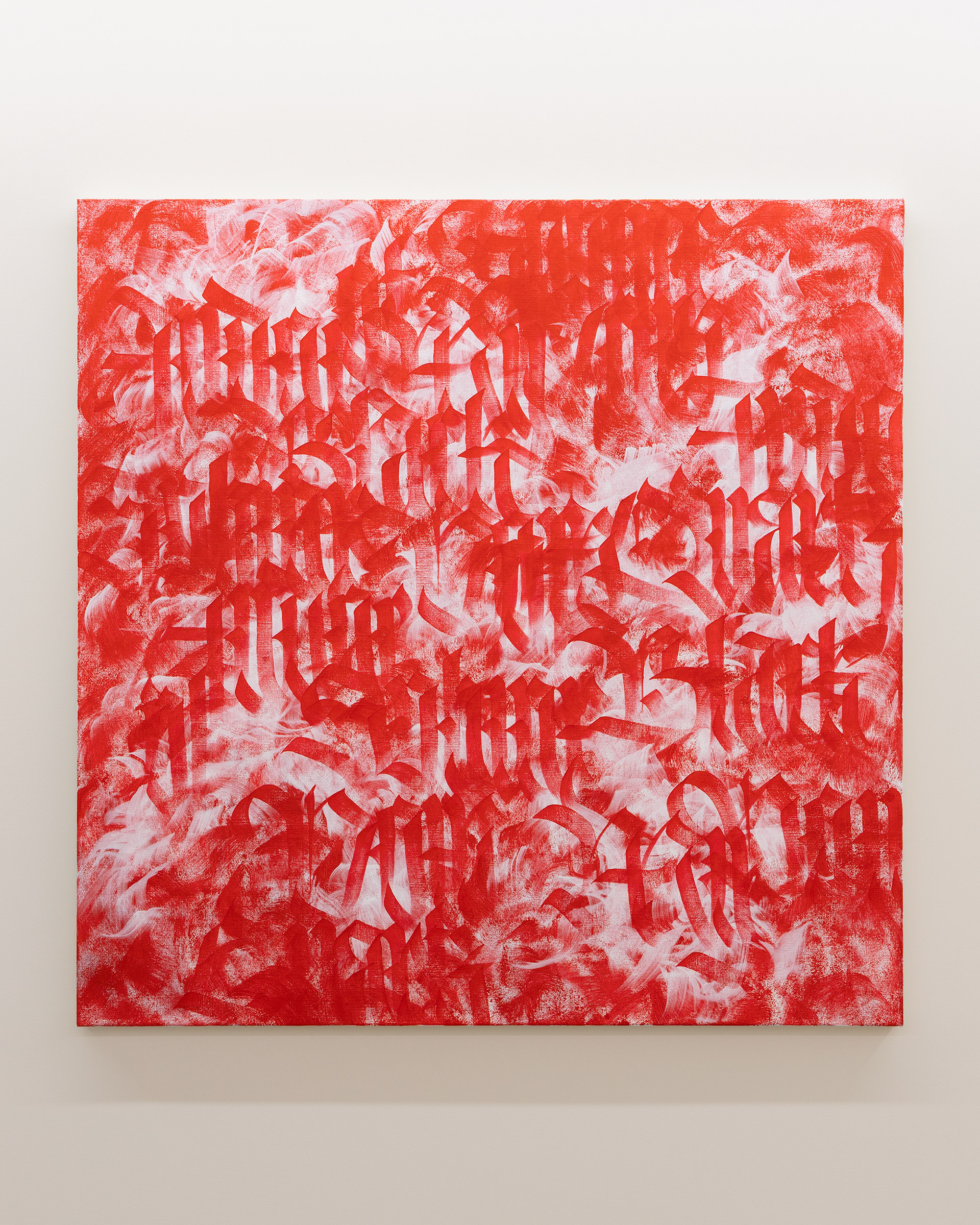
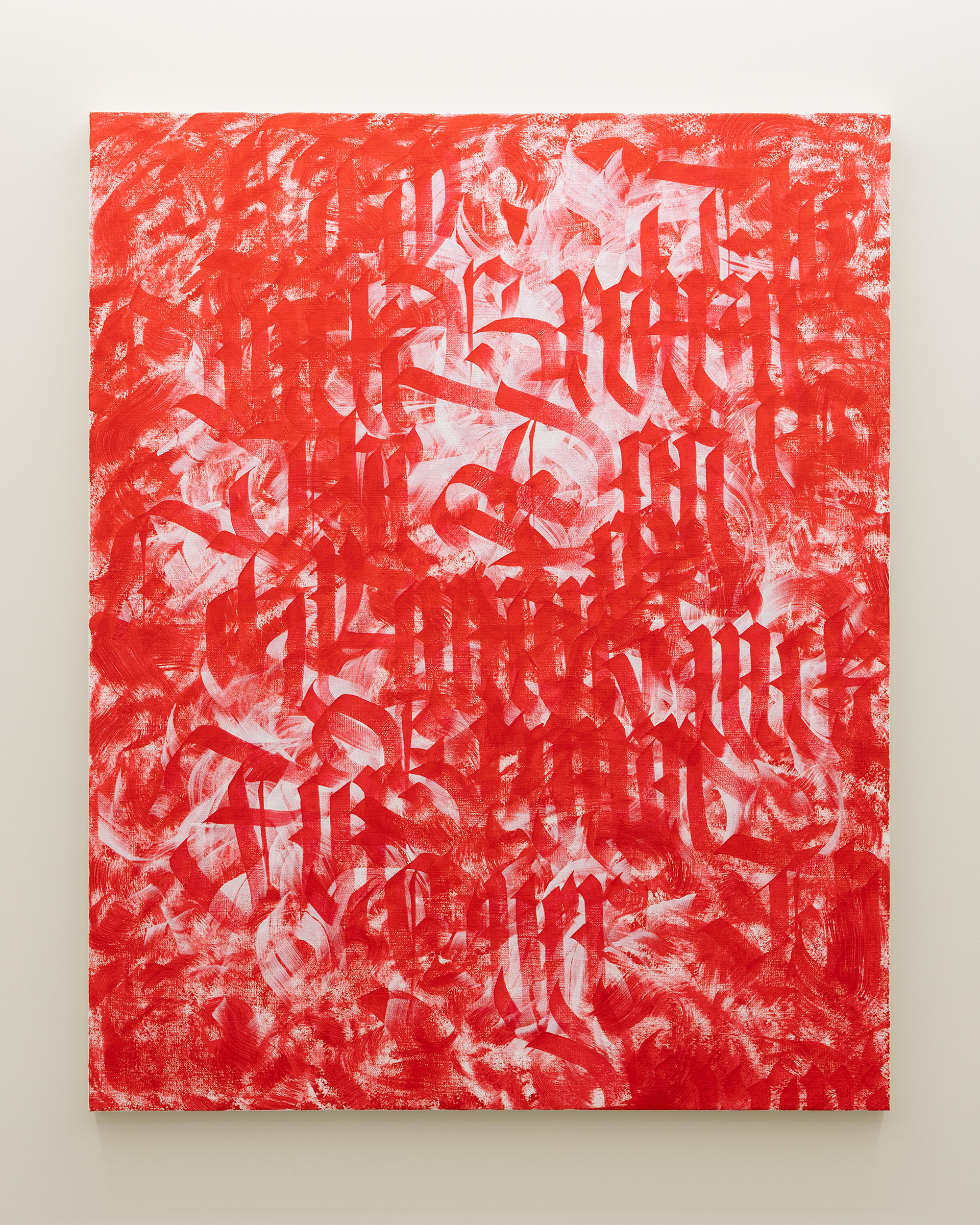
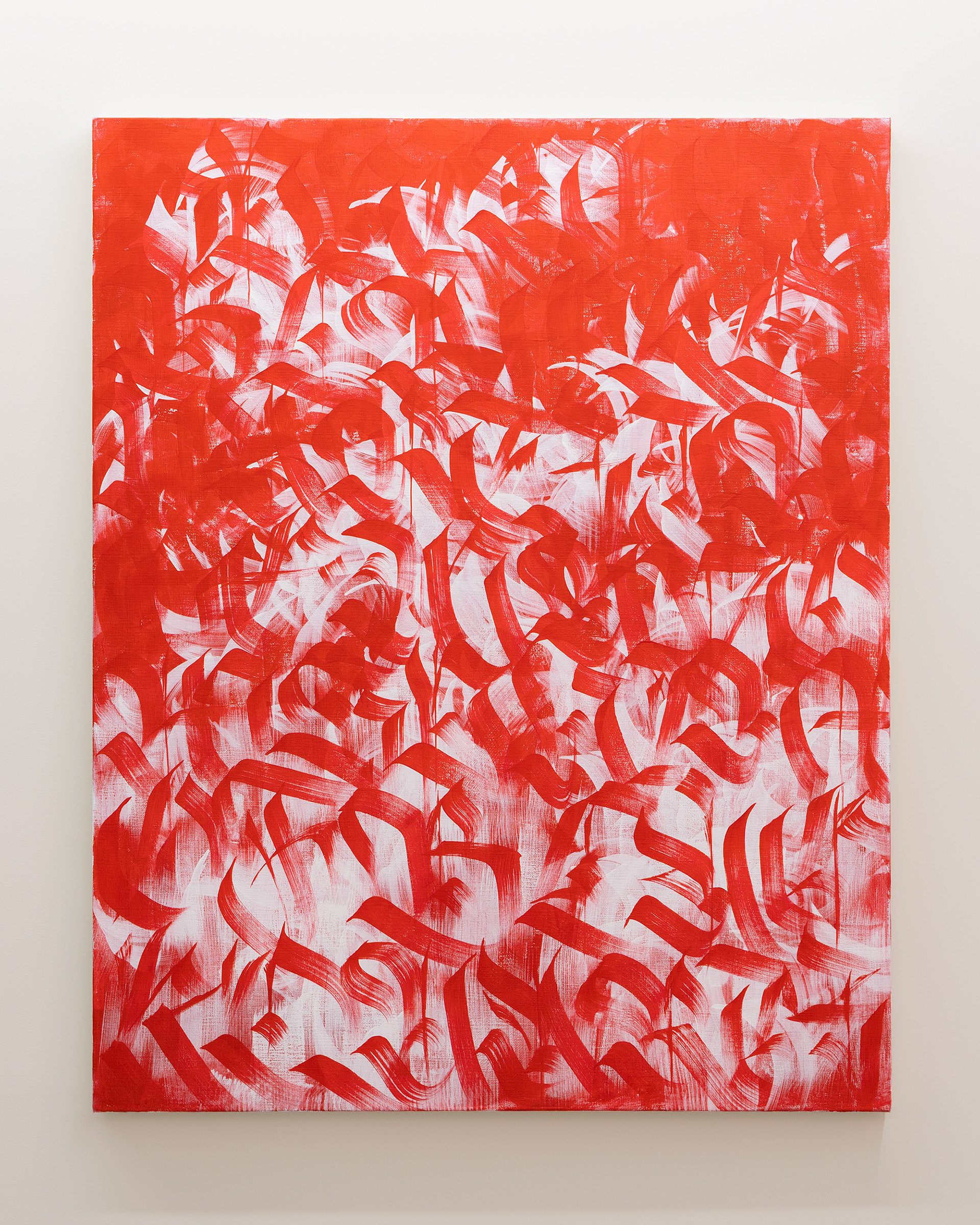
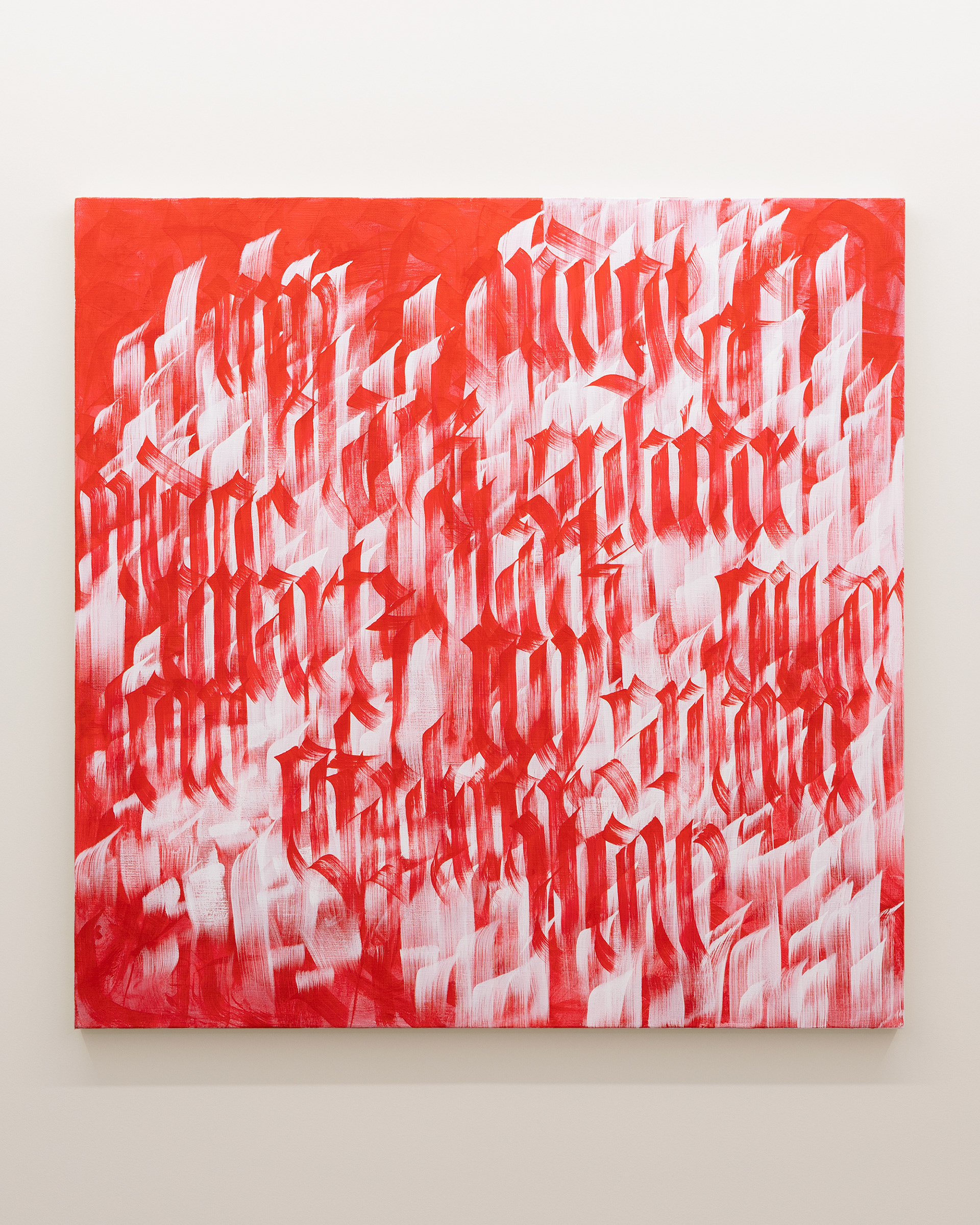
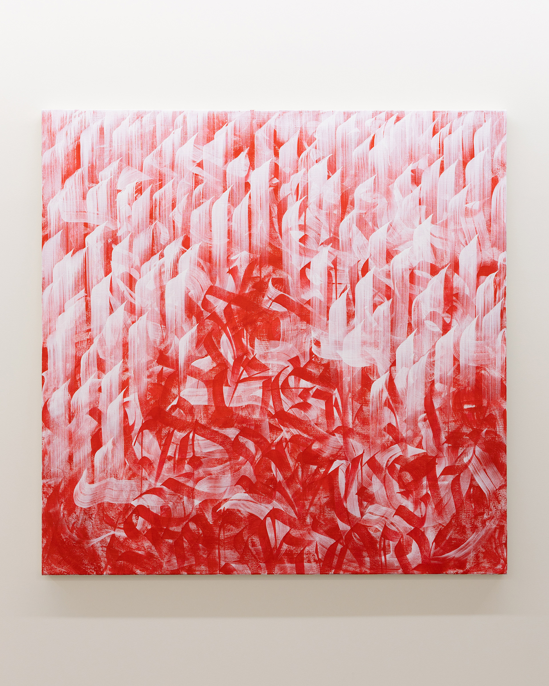
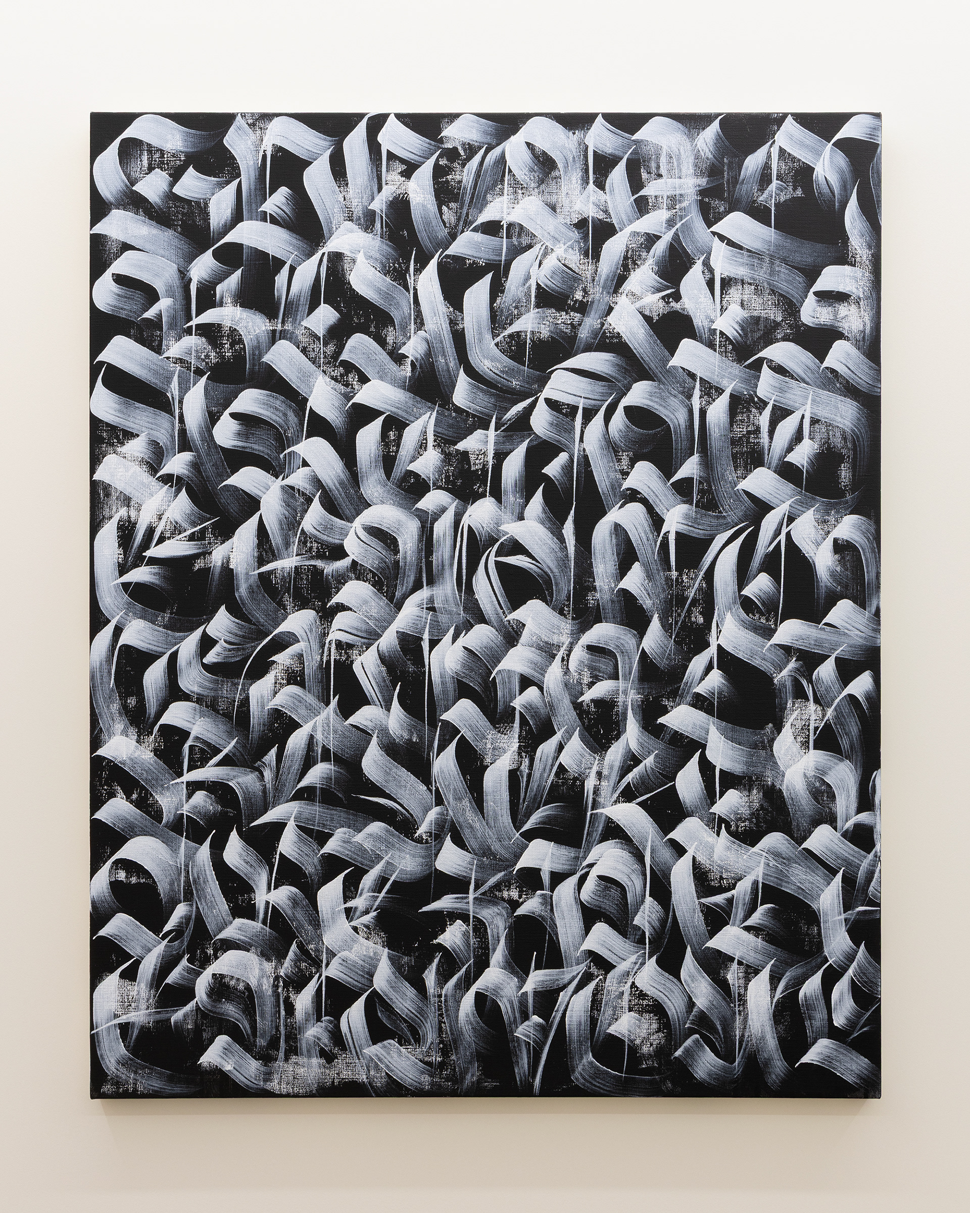
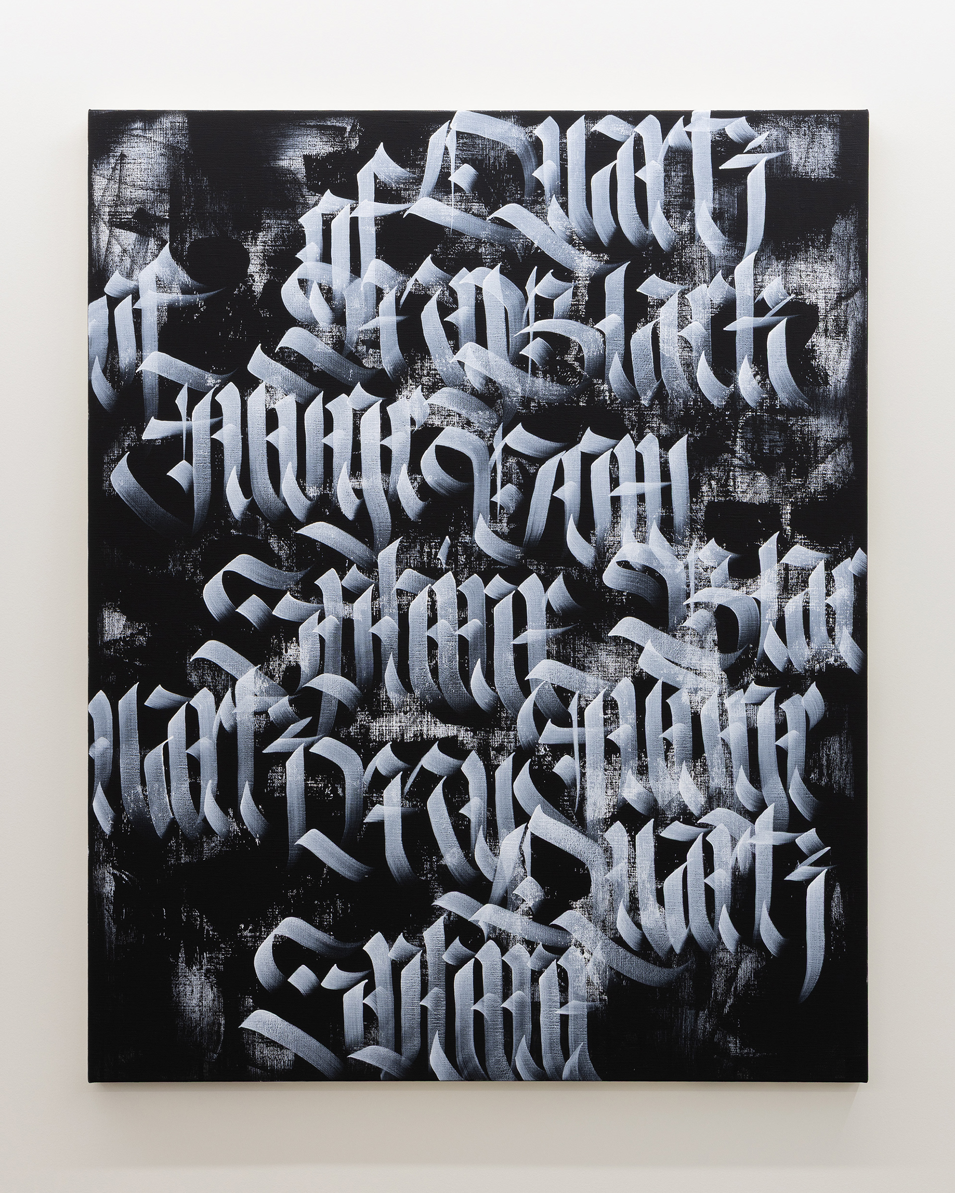
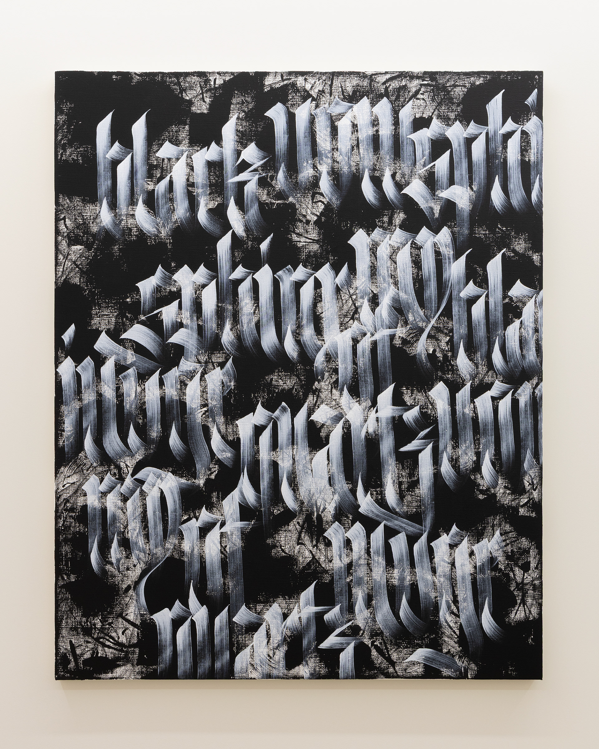
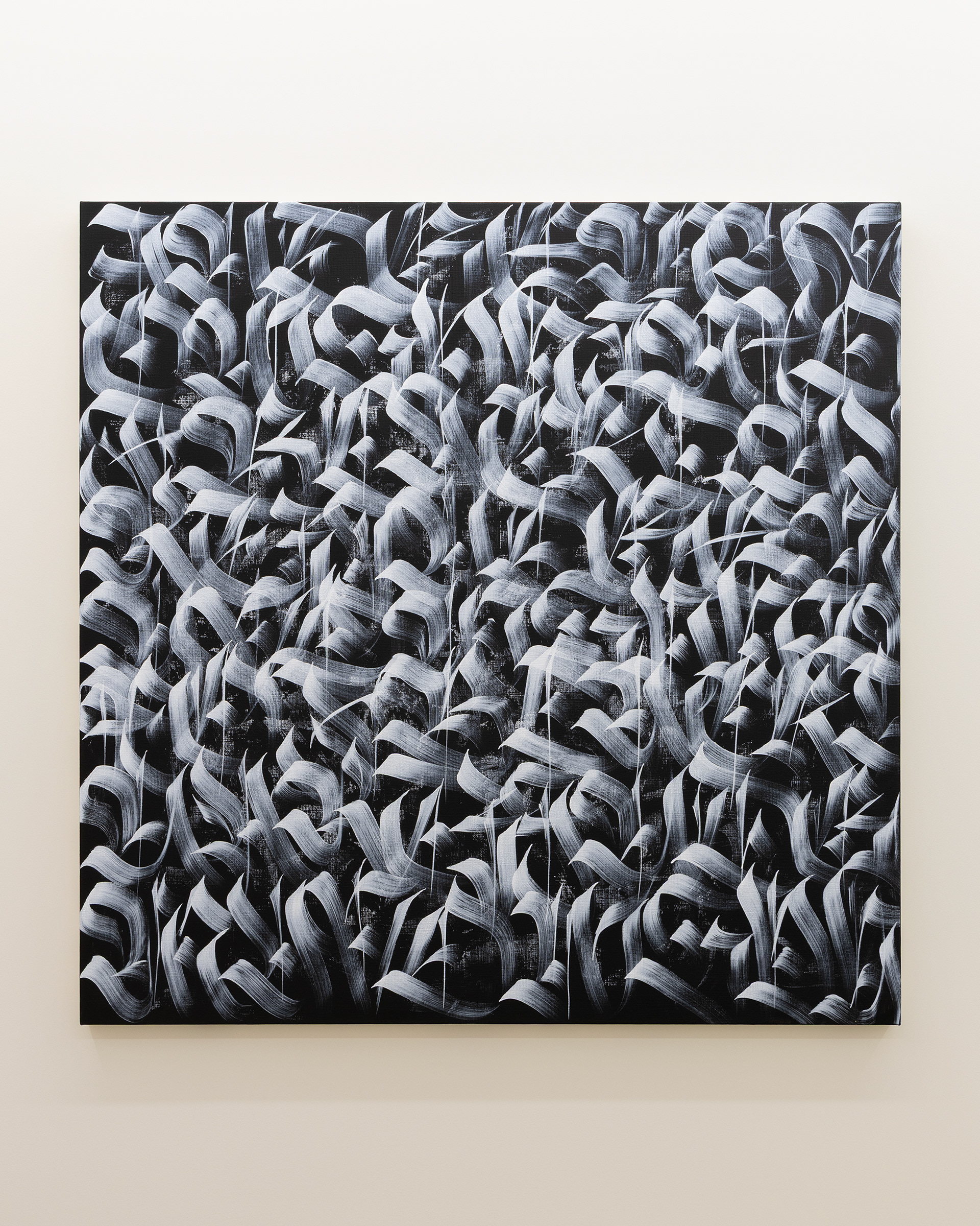
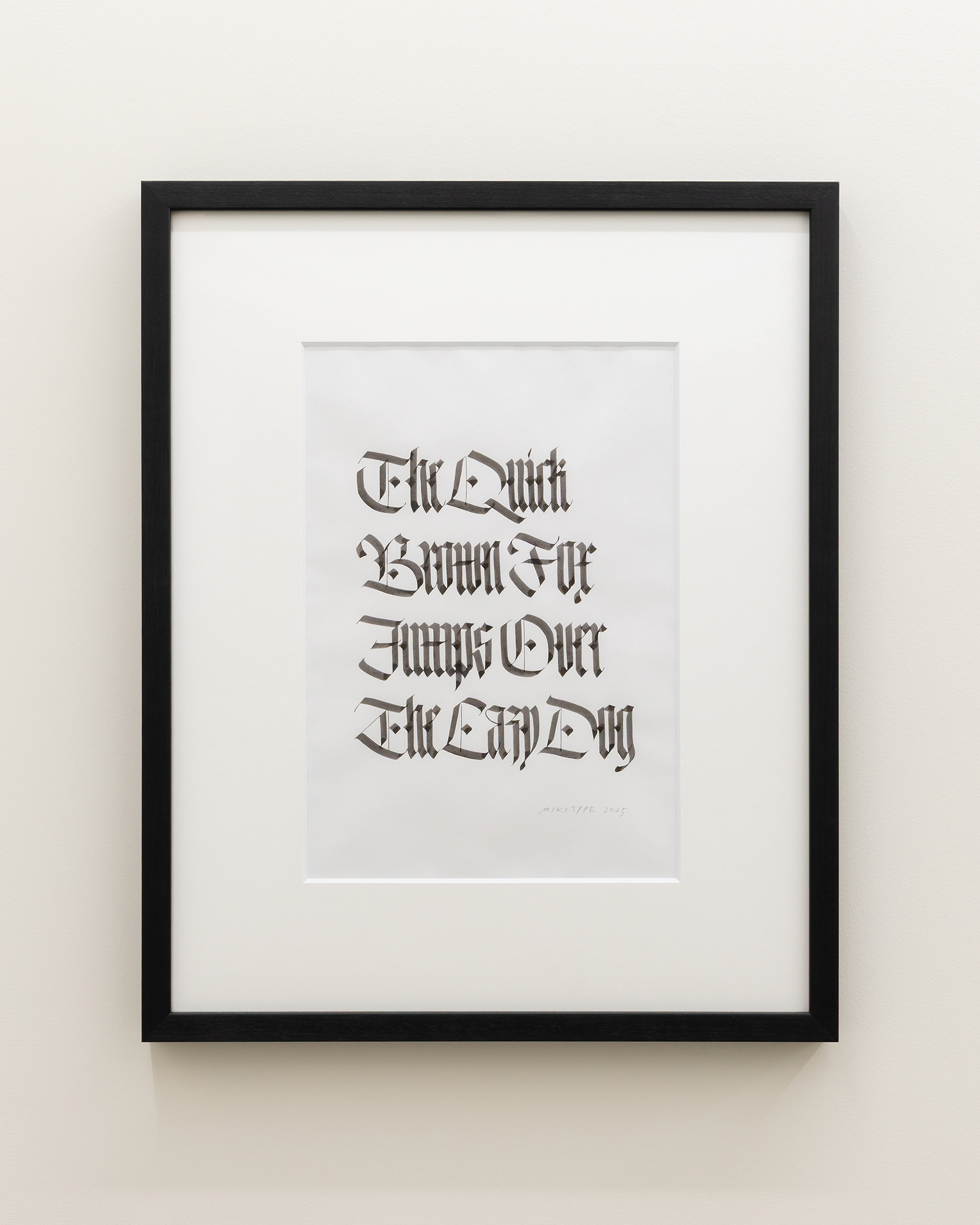
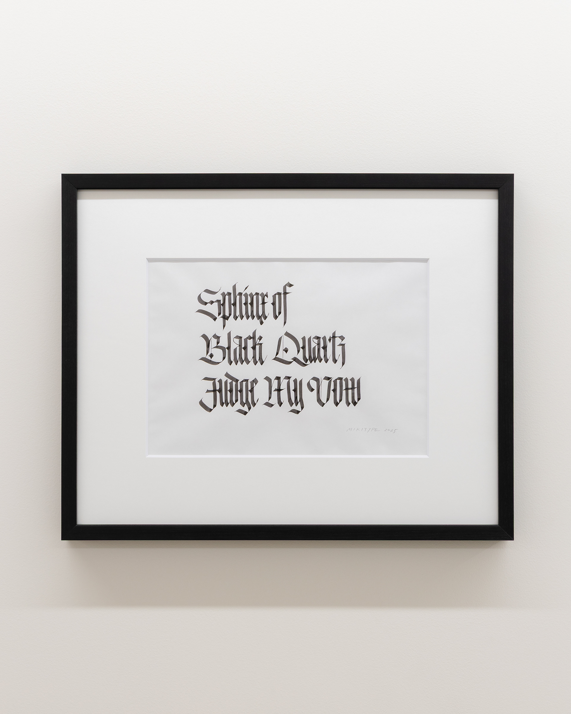
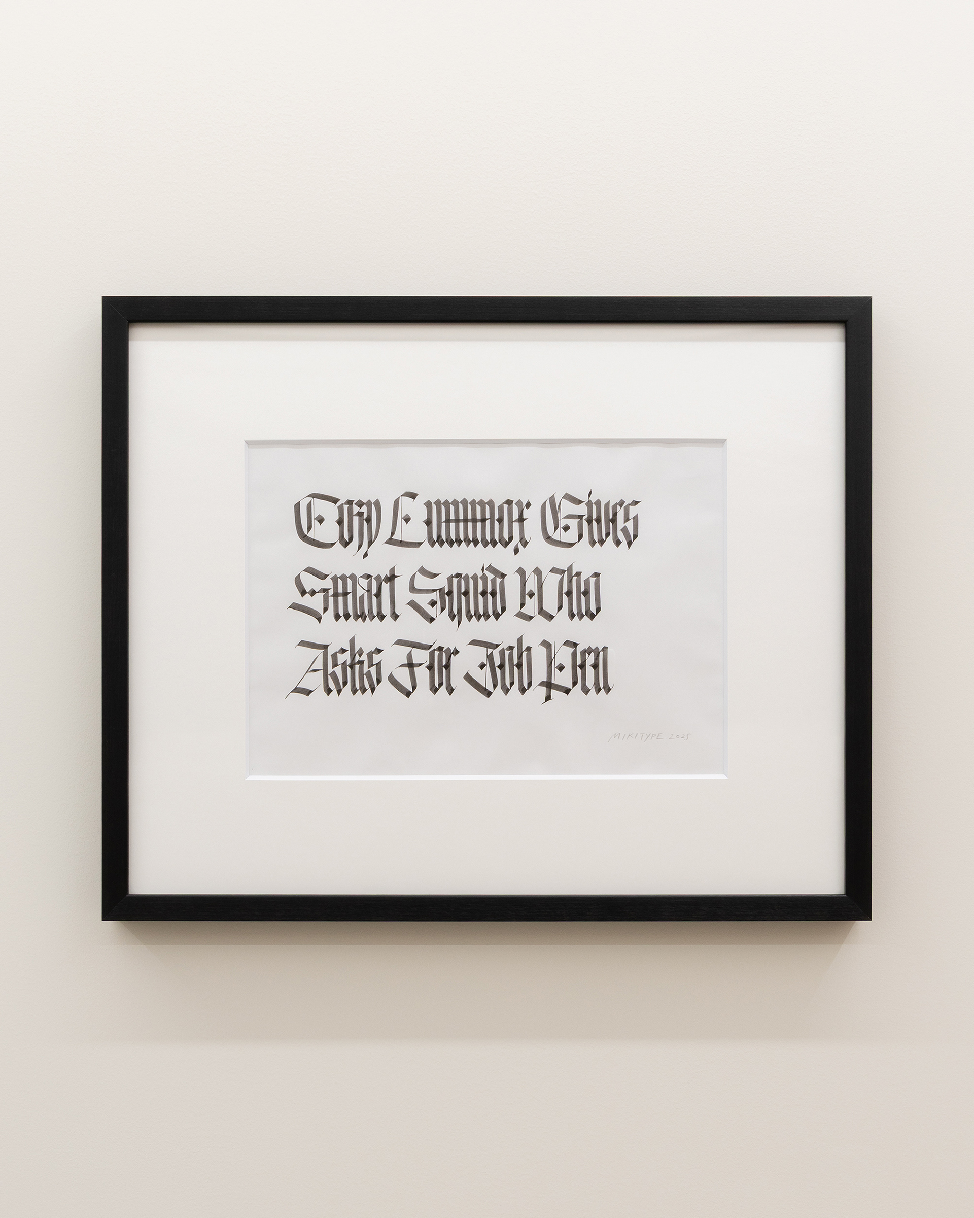
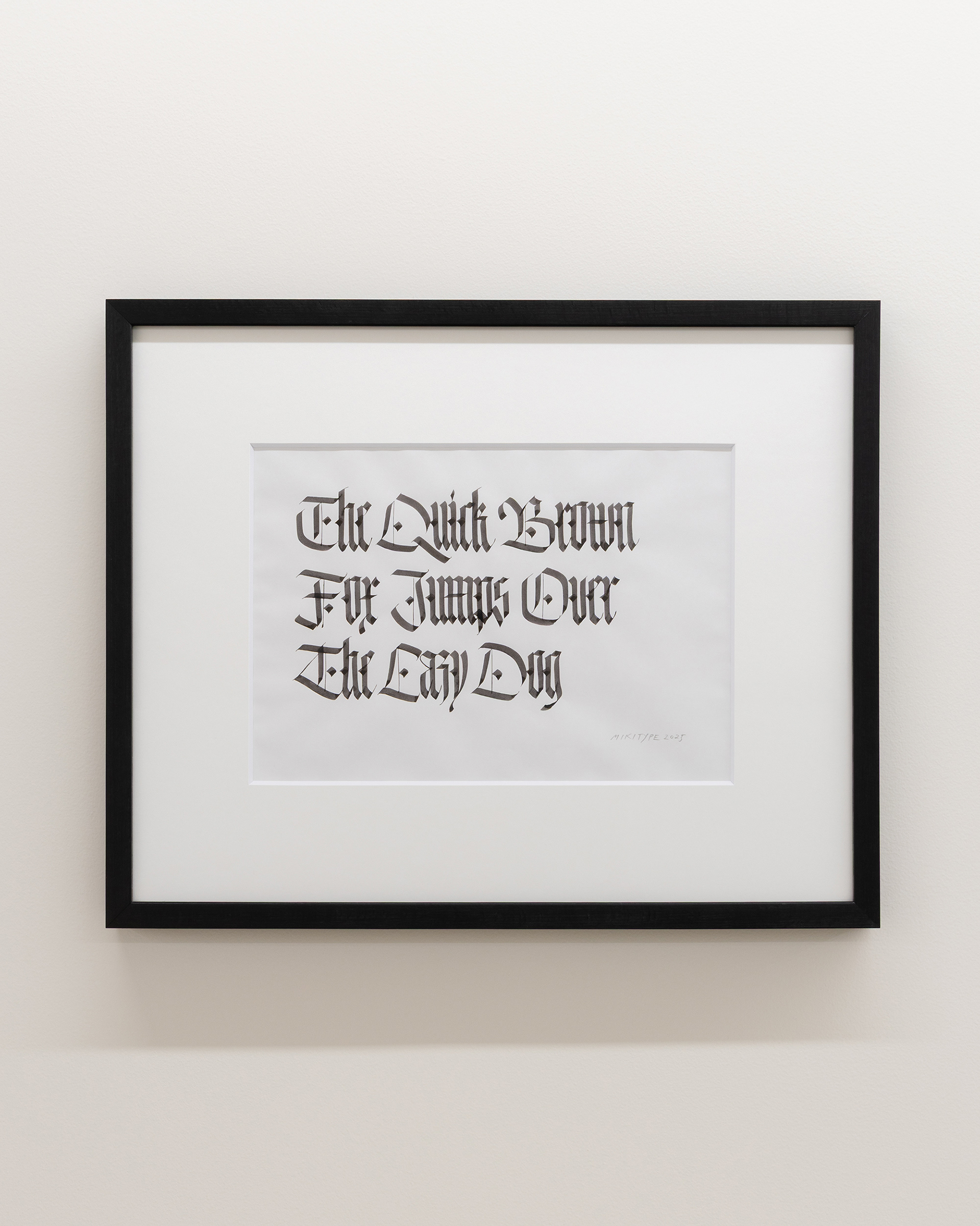
Photo Kohei Omachi